Shirt-fashion face off: The From the Press Box verdict!
Call me Gok darling! For every football team, the replica shirt is a huge money spinner for any club, and those fashion concious fans will be wanting a decently styled replica to splatter their pie of choice on.
Heres the round up of this seasons 20 teams:
Arsenal
 Instantly recogniseable as an Arsenal shirt. Slightly retro looking but should be a hit for the fans. A million times better than the monstrosity of the away kit. No fancy collar which always has a thumbs up from me. 7/10
Aston Villa
 There was quite a big launch of this kit in Birmingham, with the players modelling the kits for the fans, alongside a Villa supporting band performing and local schools taking part in a 5-a-side tournament. It’s a bit disappointing to have this revealed at the end however. It’s not a bad shirt, but I just think it lacks imagination. If anything, the amateur looking logo spoils it. 6/10 – Playing it safe
Birmingham City
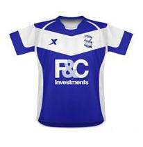
The shirt this year was chosen by a vote by the fans. A potentially flawed system in the fact that the vote could have been sabotaged. This was far from my favourite, and will probably attract comparisons with the V shirt that has been worn by Manchester United. Xtep are a unknown maker in terms of football shirt, so hoping for a high quality, hard wearing shirt for the money. Not a bad price though, considering the pre-order price of £34.99 5/10 Blues, please be more imaginative next year! EDIT – Since seeing this in pre-season pictures, it has grown on me ten fold. It’s very distinctive and actually looks smart in the flesh, if anything, we need photos of material examples next season and not sketches. 7/10
Blackburn
 This picture is from the official club shop – firstly, I need to point out that they should make better effort in the pictures of the shirts for the club shop. This is so unprofessional for a top level club, and to be honest, I don’t think a massive amount of the shirt anyway. I have a thing about collars on football shirts, in the fact that I’m not a fan of them. Here it’s a sort of V-neck/collar hybrid which I’m definately not a fan of. I know there isn’t a massive amount you can do with a shirt that has to have the colours in the way they are presented. Perhaps paring the collars back and having an incredibly plain but classy shirt is the way forward? 6/10
Blackpool
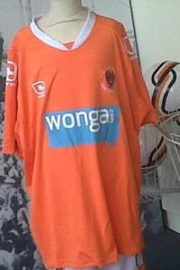 Decent colour? Check. Correct shade of orange for the fans? Check. I think I’ve worked out the trend this season, and it’s obviously for terrible TERRIBLE sponsorship logos. There is just no attempt to make it fit in with the shirt, it stands out like a sore thumb. It’s just a terrible reminder of that horrible advert where a chubby man shouts Wonga at us. Obviously Blackpool fans will be hoping they can survive this Premier League season, but if they go down, would they really want this shirt as part of their Premier League legacy? 3/10
Bolton
Anything has to be better than the thing released last year by Bolton, whoever came up with the stripes coming out of the bottom?! This year, they seem to have played it safe with this plainer option. I always think plain white shirts look smart, but the red lines seem to detract from the overall effect. Will be a bugger to get beer spills out of aswell. Good enough effort though. Priced at £39.99 7/10
Chelsea
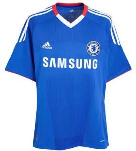
Actually quite a radical change of style from the Chelsea kit, with the introduction of the red to the collar, and white definition around the neck. Some fans may not be impressed by the subtle dye job but I like it. Interesting idea though, I quite like it. Priced at £42.99 8/10 – A different way of adding colour
Everton
I love this shirt. Plain, but still tonal with the different material on the front of the shirt. The shirt is instantly recogniseable just because it is so plain, and the sponsor looks like it’s meant to be on this shirt without dominating it. Many sponsors look terrible on shirts, but the Chang logo just seems to fit. A simple round neck just completes the deal. Classy. 9/10
Fulham
 Cheap, cheap and cheap. I hate the novelty Kappa logos on the shoulders. I don’t like the logo – it looks like something I knocked up. Necks ok, but thats about it. 3/10
Liverpool
Gone with a retro looking feel with a change of sponsor this year. Really not sure on the round neck collar or the appearance of the pattern in the material. Maybe the kit maker thought a retro look might bring Liverpool some of the glories from the past? Needs to be seen in person to make a firm judgement, but not a fan at the moment. 5/10 – lacking imagination
Manchester City
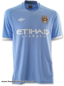 Like the Everton shirt, this is incredibly plain. I like plain, I don’t want bells and whistles when it comes to a football shirt. As long as they get the clubs colour right and the badge is in the right place, nothing else really matters. Very much so a copycat of the template for the England away shirt, but the style seems to almost fit the Manchester City colours better. 8/10
Manchester United
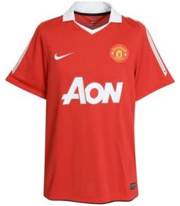 This is a massive departure from last seasons shirt with the black V. I think the new AON logo actually adds to the retro feel to this shirt, which has been pared down and is quite simple really. The collar isn’t too bad, but I don’t think it’ll go down as a shirt classic. 6/10
Newcastle United
 It’s difficult to make a stripey shirt look interesting, ala Sunderland but this isn’t bad. The neck is a bit strange an the position of the makers logo is slightly odd. Good thing for Newcastle fans is that the shirts don’t vary a massive amount so there isn’t much need to buy a new one every season. 5/10 – standard affair
Stoke City
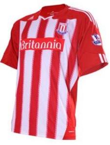
A change of kitmaker for Stoke this year, from Le Coq Sportif to Adidas. It can be hard to make a kit that has to be stripey, look individual. However, this kit seems to achieve it. I really like the neck and the slightly quirky placing of the Adidas logo – it looks like a kit which is individual, rather than a kit design that is produced in a number of colours by the same shirt maker. The only thing I’m not entirely struck on is the appearance of the blurred lines down each stripe on the shirt, but perhaps this will again look better in person. Nice to see a little imagination on the kit here. Pre-orders are priced at £39.99 8/10 for creativity.
Sunderland
 Simple, but I actually quite like this shirt. No fancy gimmicks, just the clubs colours, a decentish sponsor and the badge over the heart where it is meant to be. Umbro haven’t done too badly at all this season with kit design. 7/10
Tottenham Hotspur
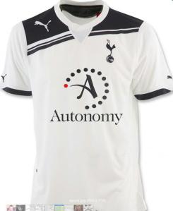
Now this is what I call sexy. Spurs always seem to have nice shirts, which always seem to appear quite tightly fitted. The design is minimal yet innovative and should look fantastic on a nice toned footballer. Ooh I’m having a moment. Shame about the sponsor, but I’ll get over it. 9/10
West Bromwich Albion
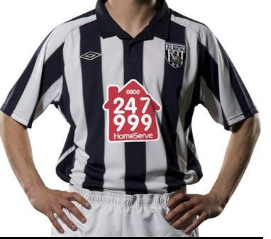 There is so much wrong with this shirt. The logo – I mean, it’s cheap and tacky looking and placed far too low. The logo resembles something I’d expect to see on a lower league shirt. The collar just reminds me of the horribly polo shirts we were forced to wear during high school. A clanger for Umbro here, even placing the logo appropriately would improve this shirt ten fold. 4/10
West Ham United
 This shirt just shouts old at me. Old fashioned collar, old fashioned design. Theres nothing spectacularly bad about the shirt, its just not spectacularly brilliant either. Yet again theres a logo that lacks imagination, which matches a shirt which lacks imagination. Macron, try harder next year 5/10
Wigan Athletic
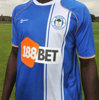 I really like this. It’s recognisable as a Wigan shirt, but at the same time it’s different to everything else in the league. The logo almost looks as if its been designed to fit in with the design, and it has a decent enough round neck collar. I really don’t think Latics fans can have anything to moan about in terms of the shirt design here. 10/10
Wolverhampton Wanderers
 Wolves shirts are never going to be radically different, sticking to the template of Gold with a bit of black. I’m not sure about the collar though, it looks like a dodgy Harry Hill impression. The fabric is meant to be full of technology in the fact that it is meant to draw moisture away from the body – brilliant for you sweaty betty fans. Costs £40 for an adult shirt 6/10



I’d agree with much of what you said there. The Spurs and Wigan shirts are streets ahead.
Both with a retro feel though. The Wigan stripe is like the Luton strip of the 70s, while the Spurs shirt is reminiscent of the England 1982 shirt and a number of mid-80s shirts.
Blackpool’s is horrible though. West Brom have always had odd choices for sponsors. There was the No Smoking symbol they had one year, which looked bizarre (if worthy).
I’ve never liked stripes for replica shirts, which is awkward because my team plays in stripes. But they never look smart and they don’t go with anything. I expect a lot of fans of stripey-shirted clubs buy the ‘leisurewear’ instead, like polo t-shirts with the club crest tastefully mounted.
Steve X
July 22, 2010 at 6:19 pm
[…] casts her “fashion eyes” over the 2010/11 Premier League shirts. First posted on her own blog, republished here with […]
Shirt-fashion face off The From the Press Box verdict! : Joys & Sorrows
July 22, 2010 at 7:25 pm
i actually like the wigan shirt, it looks smart, and i agree with you Nicole, plane shirts are always the best, u cnt go wrong with just a normal football top with a badge on it.
by the way Everton shirt 10/10 =D
Will Fazack
July 22, 2010 at 8:19 pm
Chelsea 10/11
CheapShirt
July 26, 2010 at 6:04 am
loving the new sunderland kit, the away one is even better , similar to liverpools old cany away top.
Sunderland
Sunderland wiki
August 10, 2010 at 3:43 pm